Social Paws.

Social Paws is a boutique dog daycare and hotel based in London, offering a spa-like experience tailored to each pet. Designed for discerning owners who see their dogs as family, it prioritises personalised care, emotional enrichment, and comfort. The brand stands for love, safety, and style—treating every detail as an expression of the bond between human and dog.

The Social Paws logo strikes a balance between elegance and warmth. The refined serif in “Social” suggests exclusivity, while the playful, paw-stamped “Paws” introduces charm and comfort. This contrast reflects a premium yet joyful experience. The supporting brand elements enhance versatility and recognition across touchpoints, making it perfectly suited for a canine retreat that feels more like a spa than a dog day care.

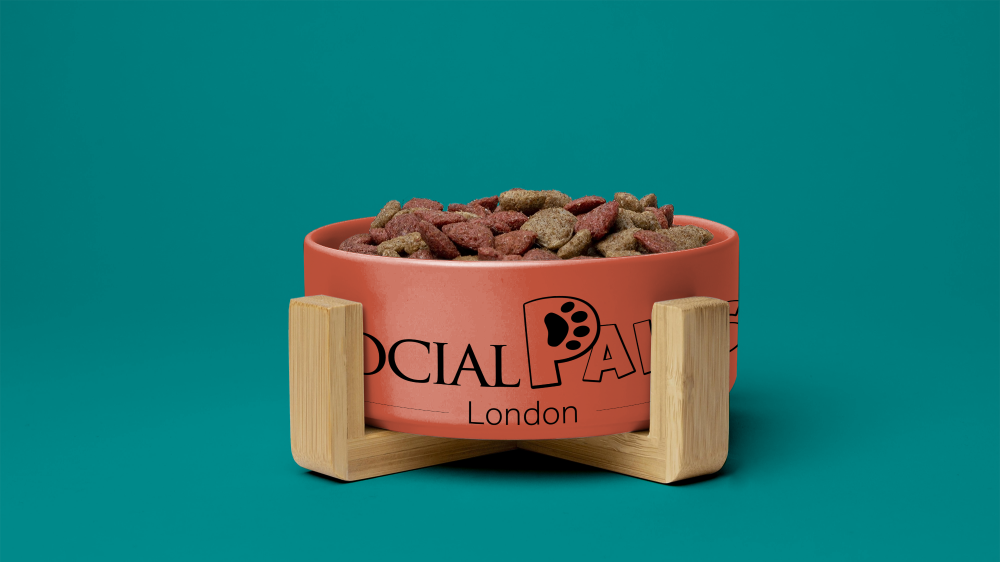
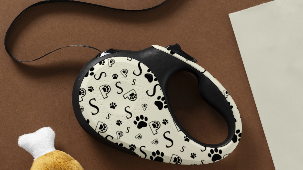
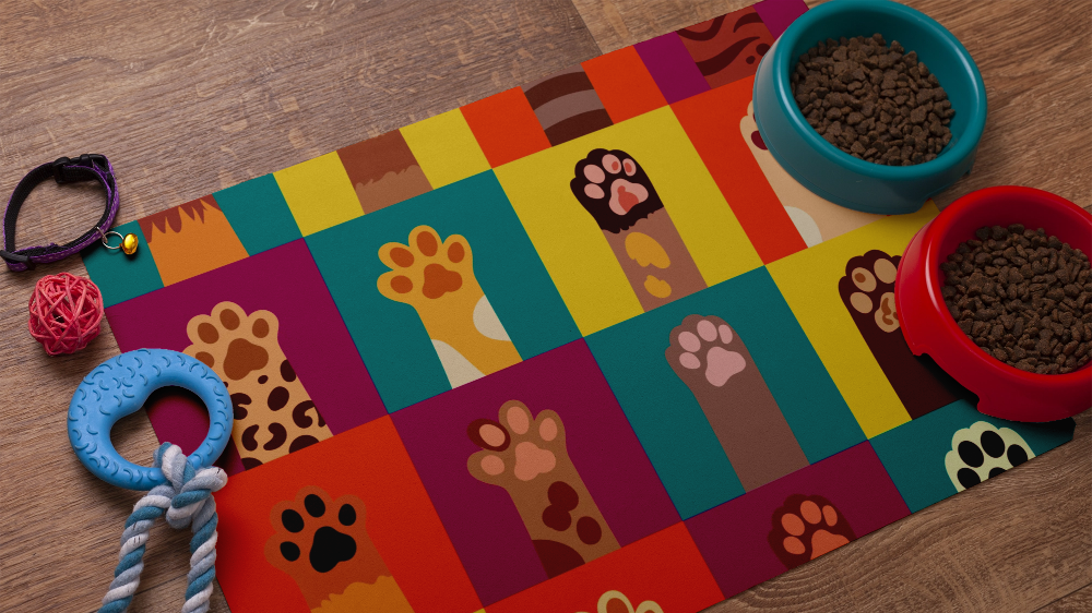
The brand patterns embrace playful sophistication. The monochrome print ensures elegance and adaptability, echoing the logo’s visual language across touchpoints. The vibrant paw grid celebrates individuality, joy, and diversity, mirroring the unique personality of each dog guest. Together, these visuals extend the brand story, transforming surfaces into expressions of comfort, care, and charm within a high-end pet hospitality experience.
The chosen colours energise the brand while preserving warmth and approachability. Teal brings calm sophistication, orange adds vibrancy and playfulness, yellow conveys joy and comfort, and magenta introduces a bold, premium flair. These tones create an inviting atmosphere that reflects the spa-like experience offered, bright, positive, and designed to reassure both pet and owner.
The symbols work as an adaptable visual system. The paw communicates affection and care, the “P” with a pawprint anchors brand recognition, and the elegant “S” nods to the premium aspect of the service. Used flexibly across platforms, these elements enable visual cohesion while offering playful variation, reinforcing memorability in a joyful and refined tone.
Asset 4
Asset 6
Asset 5
Asset 3
The system of colours and icons enables a rich visual ecosystem, offering broad versatility in brand application. From bold signage to subtle product detailing, each item maintains strong recognition while adapting to the environment. The paw-marked “P” becomes a landmark, while supporting patterns infuse warmth and personality, ensuring even the smallest item, like a leash, becomes an extension of the brand experience.
This modular identity thrives across physical and emotional touchpoints. The joyful grid on feeding mats, the elegant type on bowls, and the dynamic contrast of leash patterns prove how cohesive a system can be when icons and colour codes work in harmony. Every element, from retail to ritual, reinforces Social Paws as both luxury and love.

CONTACT.