
CDA.
CDA Steel is where engineering meets precision. Born in 2021, the company specializes in crafting smart, high-performance metal structures for industries that demand speed and quality, like pulp and paper. Backed by expert teams and cutting-edge tech, CDA delivers bold, custom-built solutions with industrial flair and rock-solid reliability, always on time and built to last.

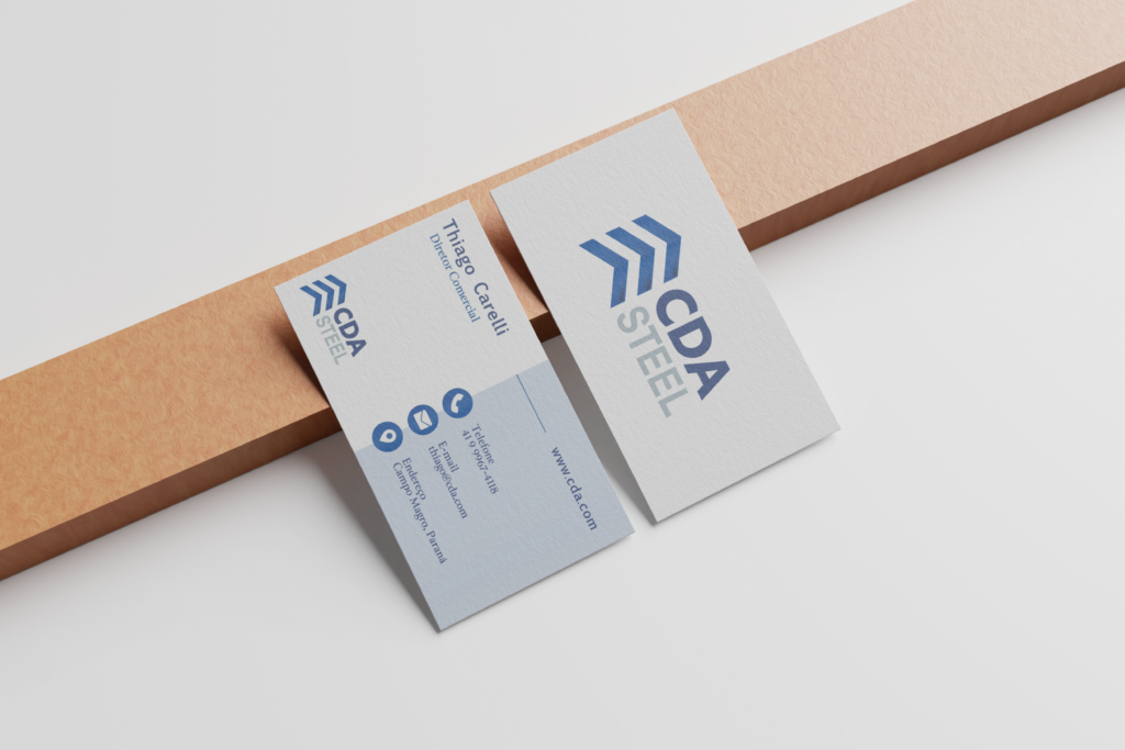
Like the company, the CDA Steel logo was designed to show strength, growth, and structure. The upward arrows reflect building and progress, which is perfect for a steel structures brand. The bold font adds a solid, trustworthy feel, and the blue tones give it a tech-savvy, modern edge. It’s clean, versatile, and built to work across any platform.


The visual identity of CDA Steel has been strategically applied to convey strength, reliability, and precision, core values in the field of metal structures. The brand stands out through the coherence between its symbol and typography, with intelligent use of space and visual hierarchy. The upward-pointing chevron icon, symbolising structure and elevation, gains prominence across all materials, from stationery to safety helmets, ensuring instant recognition. The consistent industrial blue and technical grey colour palette reinforces visual unity across both digital and physical applications, from office environments to construction sites.
On stationery and vehicles, the brand application reinforces a clean, professional corporate presence. The bold, sans-serif typeface ensures readability at varying scales, while the use of iconography on business cards enhances ease of information access. The identity also performs effectively on three-dimensional surfaces, such as helmets and delivery trucks, demonstrating both versatility and institutional strength. This attention to detail across all brand touchpoints communicates trustworthiness and positions CDA Steel as a technical leader in the construction and industrial sectors.


The digital application of CDA Steel’s visual identity stands out for its aesthetic consistency and communication clarity. In the institutional PDF presentation, the visual elements reinforce the brand’s technical positioning through a cohesive colour palette, disciplined typography and clean layout. Titles in uppercase and the consistent use of the brand’s icon and typeface create a strong visual narrative that conveys trust. The logo appears on every page, reinforcing brand presence without overwhelming the content, while the structured layout and effective contrast between text and background ensure easy reading and clear information flow.
On the official website (www.cdasteel.com.br), the visual identity is applied in a functional and objective manner, reflecting the company’s focus on engineering and operational efficiency. The predominant use of white, accented by the institutional blue, creates a digital environment that feels technical, clean and trustworthy. Navigation is intuitive and user-friendly, presenting services, mission and structure in a straightforward way. The consistent presence of the logo, easy-to-read typography and responsive layout all work together to position CDA Steel as a modern brand, committed to quality and innovation in the field of metal structures.
CONTACT.

