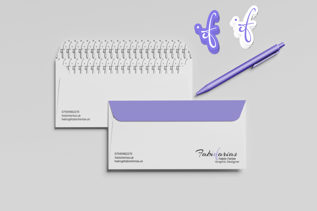
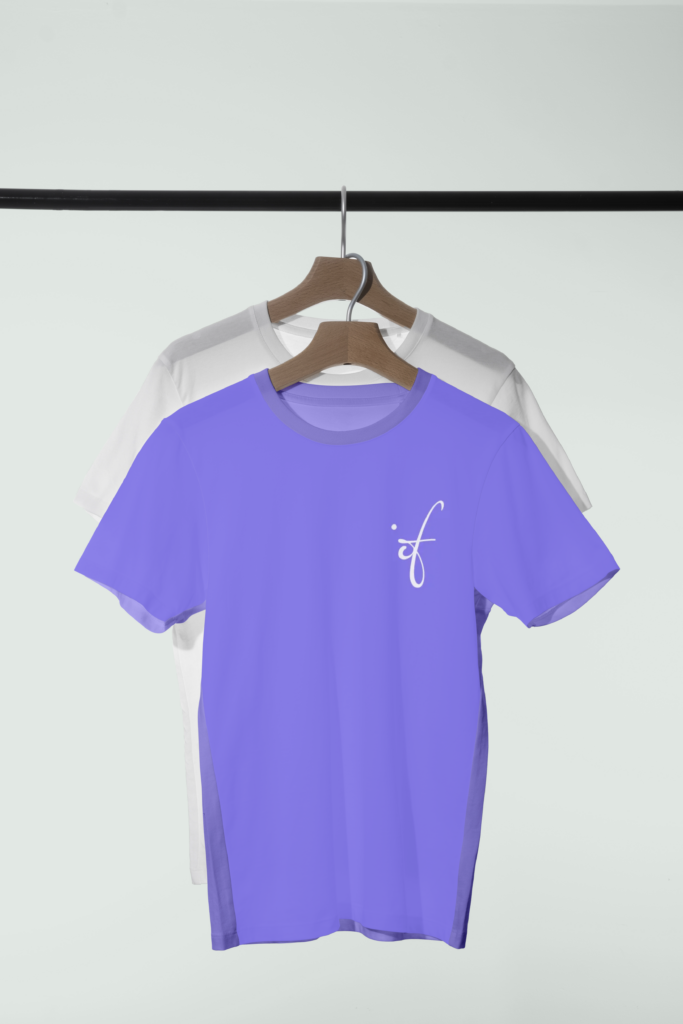
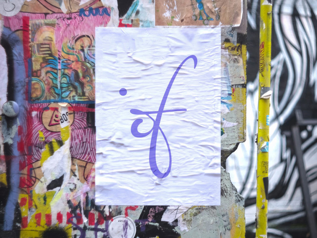
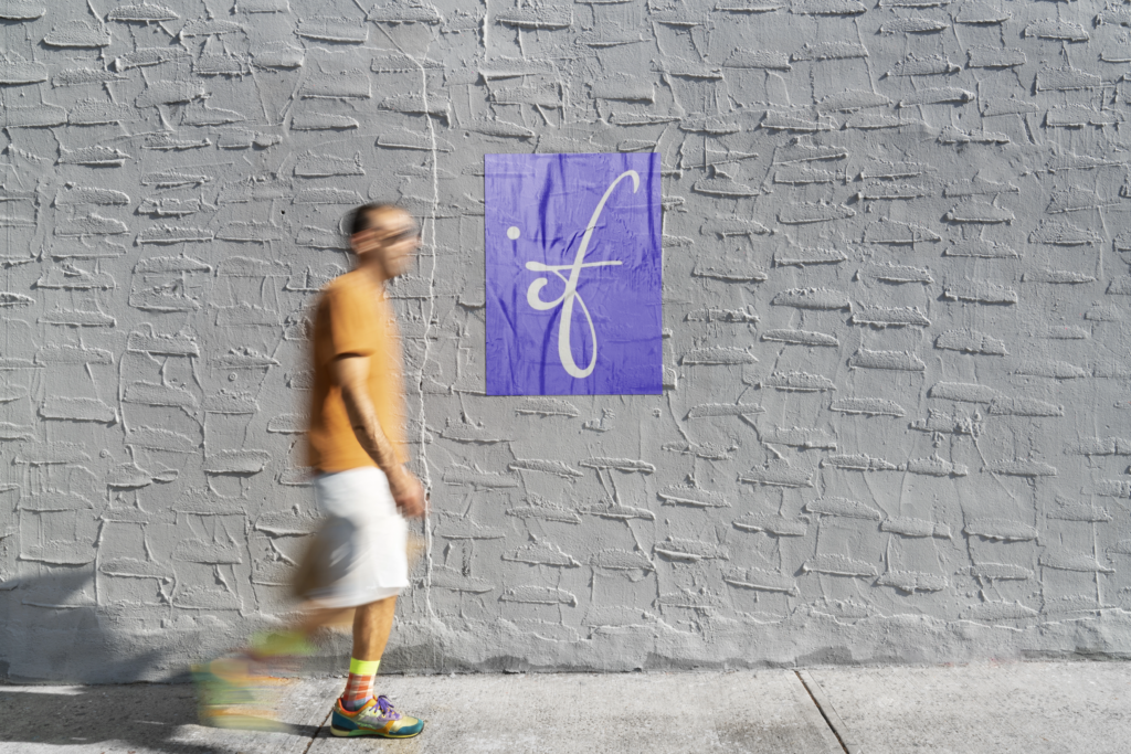
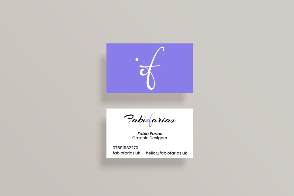
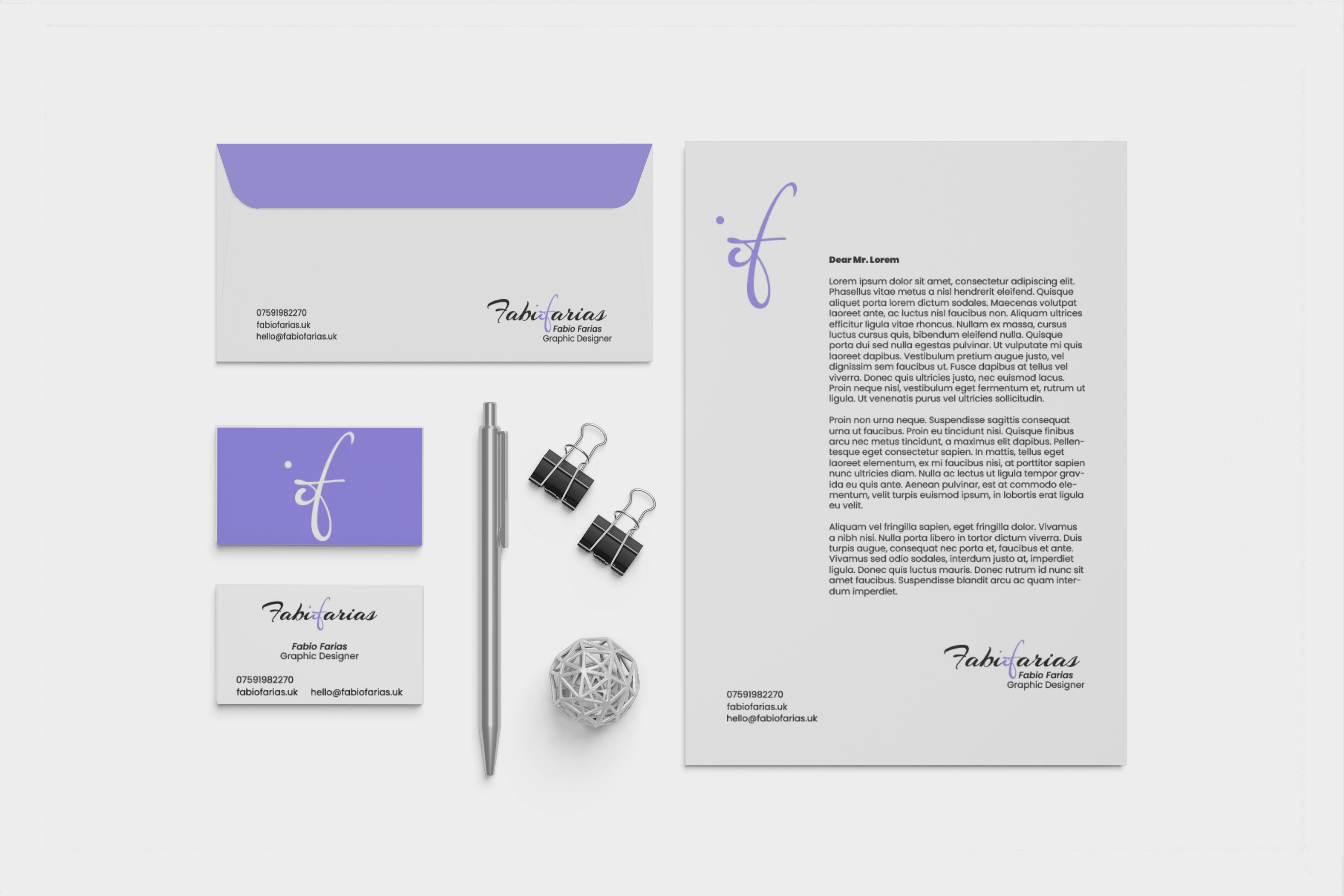
Fabio Farias.
This is my personal brand, a Brazilian graphic designer based in London. As a beginner in the field, I’m focused on building strong, thoughtful visuals with purpose. I try to blend creativity with clarity, shaped by both cultural roots and new perspectives. I’m currently exploring identity design, always aiming to communicate ideas in simple, engaging, and meaningful ways.


The fabiofarias symbol is a refined typographic composition, rich in meaning. It seamlessly merges the letter “f” from the surname with the final “o” in “fabio” and the dot of the “i”, creating a fluid, continuous form that feels both intentional and deeply personal. The lower curve of the “f” connects elegantly with the “o”, while the dot is thoughtfully placed to maintain visual balance and rhythm. This organic gesture evokes the feeling of a handwritten signature, conveying authenticity and authorship. With its elegant slant and dynamic stroke contrast, the calligraphic style brings sophistication, emotional resonance, and an artistic quality that reflects the identity of a designer with a strong, visionary voice.


The colour palette of the fabiofarias visual identity is primarily composed of lilac, white, and black, striking a balance between softness and sophistication. Lilac takes centre stage, conveying creativity, sensitivity, and a modern approach to design, while white brings clarity and lightness, reinforcing the minimalist elegance of the brand. Black, in turn, provides a solid foundation, enhancing contrast, legibility, and professionalism. This colour combination not only sets the brand apart visually but also reflects the designer’s personality, intuitive, precise, and visually refined.

CONTACT.

