Friend OFF a Friend.

Friend OFF a friend is a brand created for an emerging DJ who explores indirect connections, anonymity, and unconventional sonic experiences. Playing with language, it presents a bold, ironic, and alternative aesthetic. The identity embraces the idea of switching off from the norm, resonating with audiences who seek authenticity, freedom, and a break from traditional visual and cultural expectations.

The visual identity places emphasis on the word “OFF” as the core element, using contrast and depth to convey disconnection and individuality. Rounded typography balances boldness with approachability, and the composition reinforces hierarchy and clarity. The aesthetic leans into an alternative, modular language with strong potential for graphic expansion and adaptation across smaller formats and digital applications.

The T-shirts extend this strategy by turning “OFF” into an aesthetic and cultural statement, as if each wearer is choosing to disconnect from the mainstream and align with something more raw, independent and real. By featuring both the full name and standalone “OFF” designs, the identity adapts to different moods and audiences, offering flexibility while reinforcing the brand’s visual DNA.

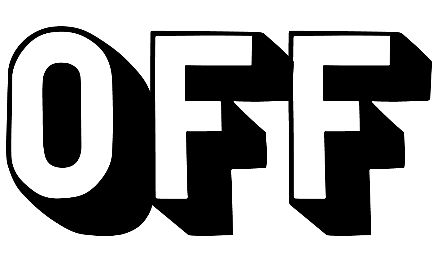
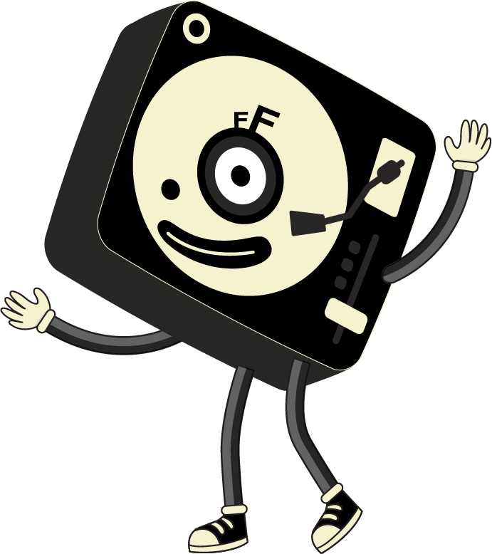
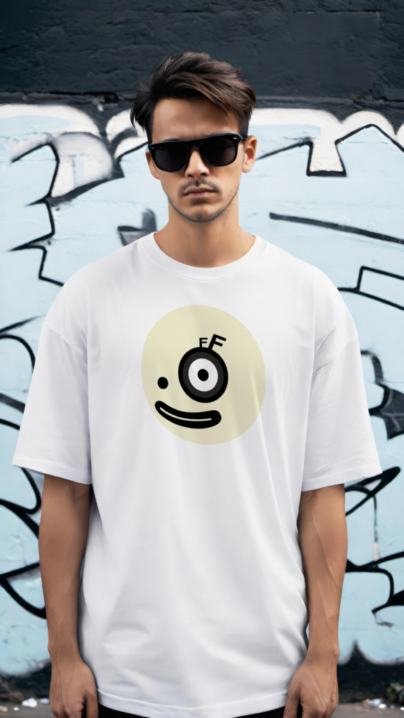
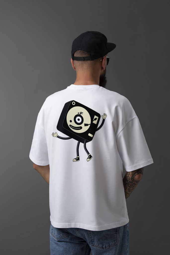
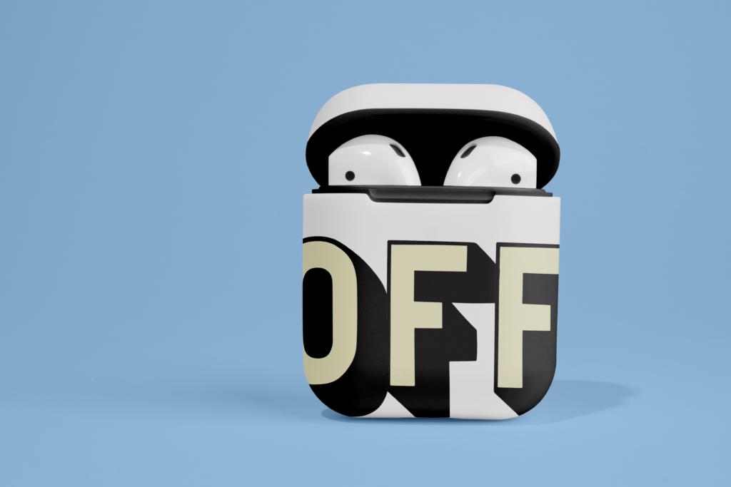
The mascot, an anthropomorphised turntable with the “OFF” symbol in its eye, transforms the brand’s core graphic element into a character, humanising the identity and creating strong emotional appeal and memorability. With simple, expressive lines and a retro-cartoon style, it works perfectly as an icon for social media, events, and products, engaging the audience in a playful and highly recognisable way.

The idea to turn “OFF” into a replicable stamp came from a desire to create a visual element with its own identity, a signature that goes beyond the name and becomes a symbol. In a space where new DJs compete for recognition, having something iconic, portable, and easily applied to physical formats like stickers builds visibility and organic reach beyond digital platforms.

The business card design is bold, functional, and perfectly aligned with the brand’s identity. The front is clean, featuring the full name against a black background, projecting professionalism while retaining an alternative edge. The reverse side, dominated by the iconic “OFF” graphic, serves as a strong visual stamp. The vertically placed QR code integrates seamlessly without disrupting the composition.

Choosing to anchor the QR code to the website (where all key details such as upcoming shows, contact and social media are hosted) is strategic and forward-thinking move. It keeps the printed design minimal and elegant while ensuring the information remains dynamic and up to date. More than just a business card, it acts as a gateway into the artist’s world, combining style, utility and personality.

Applying the brand identity to audio equipment (such as DJ controllers, headphones and earbud cases) is a strategic move that enhances the perception of professionalism and cultural relevance. By customising core tools of the DJ’s craft with the “OFF” symbol, the brand achieves constant on-stage visibility, turning each performance or video appearance into an opportunity for brand reinforcement. It merges function with aesthetics, allowing audiences to connect visually and sonically with the artist.

Looking ahead, this approach opens space for future collaborations with audio brands, limited-edition gear or promotional kits. Headphones featuring the mascot and cases marked with the bold “OFF” logo turn everyday objects into coveted items, blending music and lifestyle. These applications deepen engagement, build community and help position “Friend OFF a friend” as a living, breathing brand – one that resonates both on and off the stage.

CONTACT.