Lubcke.

Lubcke is a Brazilian company specialising in the administration of residential and commercial developments. With a commitment to transparency, accountability, and asset preservation, it serves trustees and residents seeking trustworthy and professional management.

The Lubcke identity conveys excellence in residential property management with visual sophistication and clear symbolism. The building-shaped icon suggests structure and stability, while the elegant typography communicates trust. The gold and navy-blue palette projects seriousness and value. The design reflects solidity, authority, and a deep commitment to the care and stewardship of clients’ assets.

The Lubcke symbol is a clever fusion of form and meaning: a stylised “L” that transforms into the structure of a modern building. This design subtly and elegantly conveys the company’s core pillars, management, organisation, and vision. The shape evokes the solidity of a well-run condominium, while the initial reinforces brand identity and a strong, professional presence.

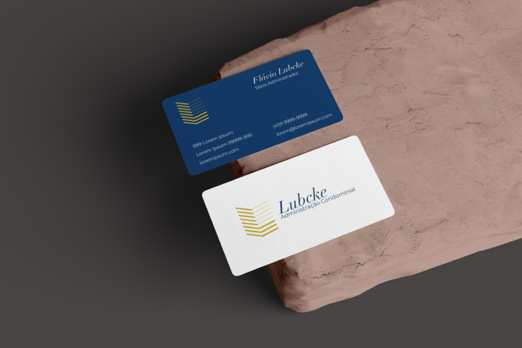
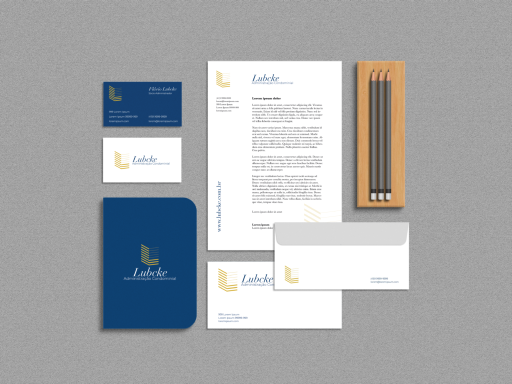
The logo’s application across the graphic materials is clean, balanced, and professional. The consistent use of the golden symbol against a deep blue background conveys reliability and sophistication. Generous white space ensures visual clarity and reinforces the brand’s authority. From business cards to letterheads, each item communicates organisation, structure, and a strong, trustworthy presence in the property management sector.

Typography strikes a balance between tradition and modernity. The word Lubcke, set in italic serif, stands out with elegance, evoking a sense of heritage and credibility. In contrast, “Administração Condominial” (property management in Portuguese) in a clean sans-serif typeface adds clarity and a contemporary tone. This typographic pairing reflects the brand’s core values: transparency, professionalism, and strategic organisation.

CONTACT.