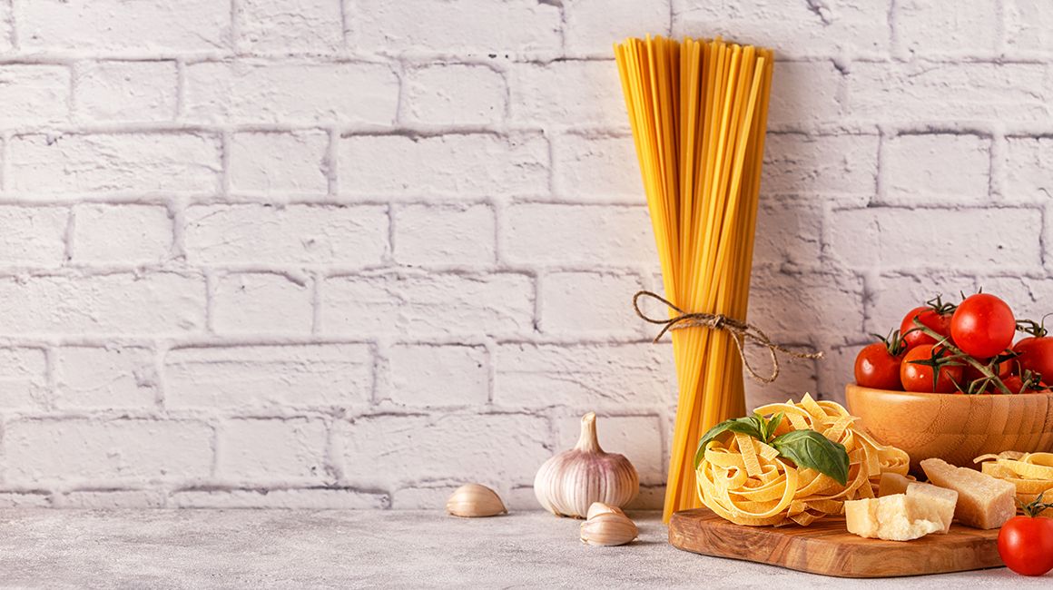
Nonna Clairê is a handmade pasta brand from Curitiba(Brazil) that celebrates family tradition with flavour and heart. Inspired by grandma’s recipes since 1939, it offers fresh pasta made with care and select ingredients. Its identity blends vintage charm, simplicity, and authenticity—capturing the true essence of homemade quality, rich stories, and a passionate Italian soul.
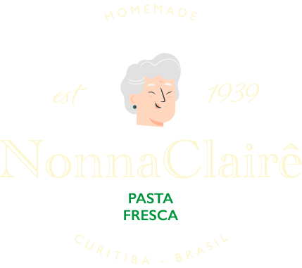
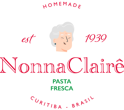
For Nonna Clairê, I crafted a logo that feels like a warm hug from your Italian grandmother. The vintage-style illustration brings personality, while classic typefaces evoke tradition and care. Bold red and fresh green nod to Italy and authenticity. It’s more than a logo, it’s a visual recipe for trust, nostalgia, and handcrafted flavour.`
(noun) [Italian] “Grandmother.” Nonna is more than just a title; she embodies warmth, love, and wisdom. She’s the heart of the family, often found in the kitchen, creating magic with her recipes and filling hearts (and bellies) with joy. A Nonna’s embrace feels like home, her stories carry the essence of tradition, and her laughter is a melody of generations. In Italy, she is the symbol of unconditional love and the keeper of family history, blending sweetness with strength.
The central figure is illustrated in a minimal flat style (Gray hair, gentle smile) intentionally simplified to be iconic and timeless. Avoiding caricature, she is designed to be universally friendly and emotionally resonant, without being overly specific or stereotypical.
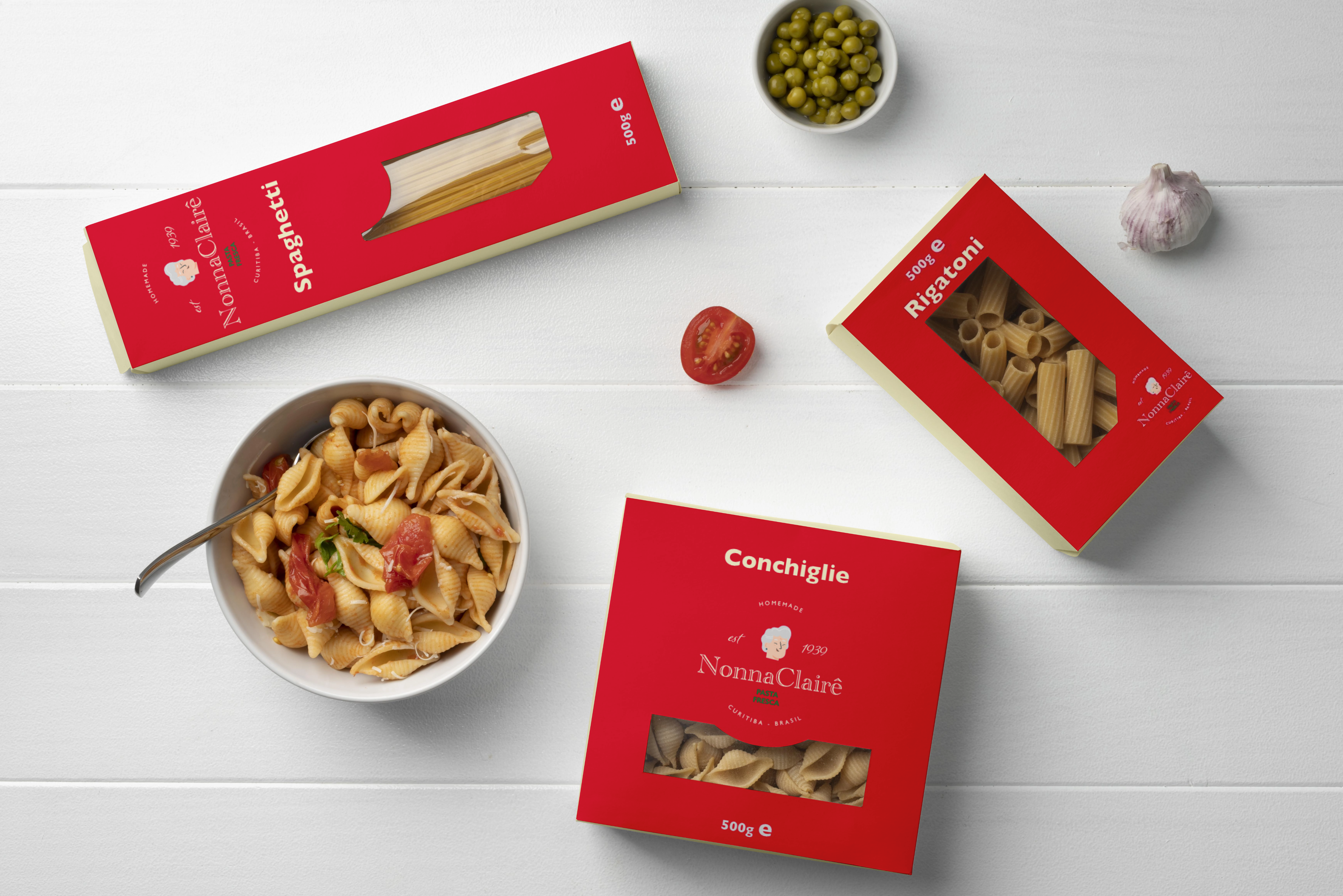
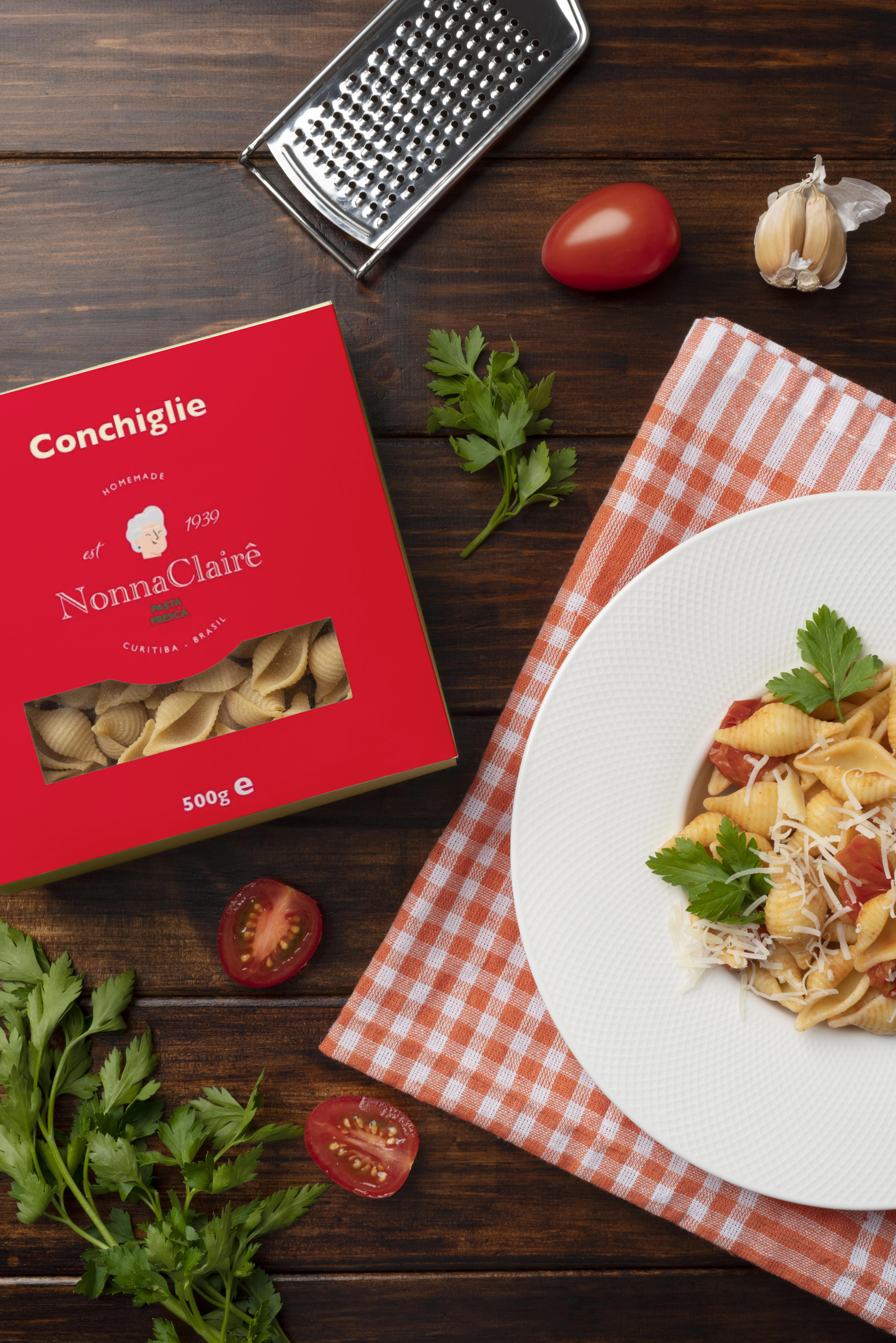
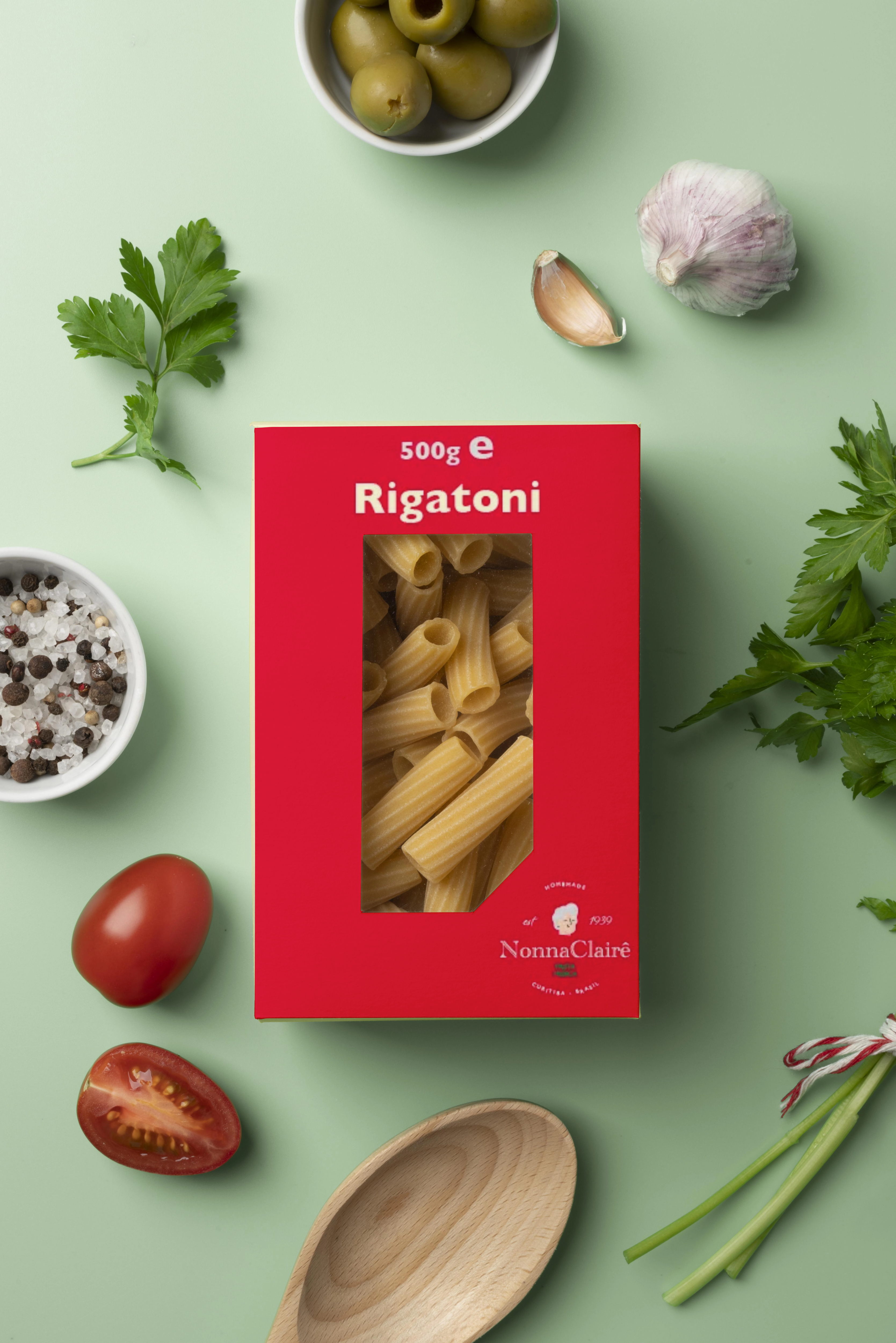
The packaging design of Nonna Clairê stands out through its bold red colour, elegant serif typography, and strategic window cutouts that highlight the product’s artisanal quality. The consistent use of the Nonna icon and minimalist layout enhances shelf appeal while conveying tradition, warmth, and premium craftsmanship. Clear hierarchy and restrained design choices ensure high legibility and brand recognition.
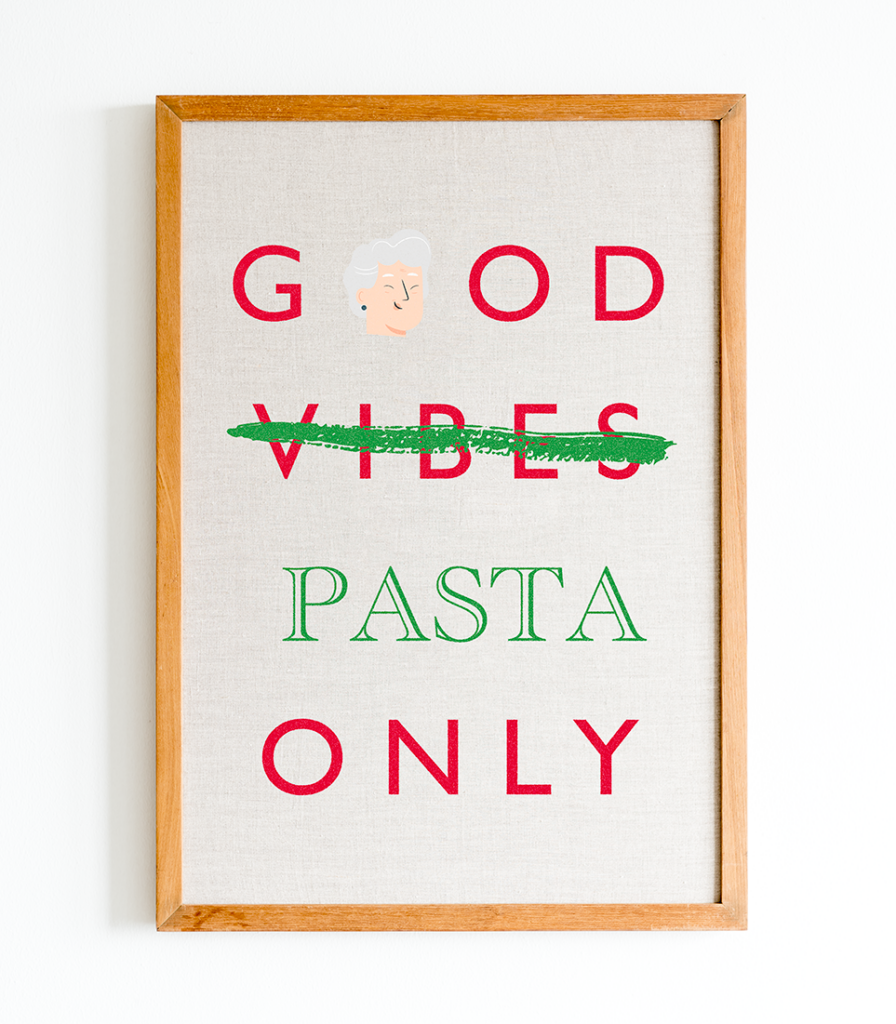
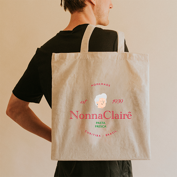
Across products and branded items, the visual identity is applied with consistency and emotional resonance. From tote bags to aprons and playful posters, the brand extends its charm with refined humour and familiarity. These applications transform everyday objects into storytelling tools, strengthening the emotional bond with consumers while maintaining a cohesive and memorable aesthetic universe.
Red conveys passion, energy, and tradition, qualities that align with a family recipe passed down through generations. Visually, it draws attention and stimulates appetite, making it an effective choice for both brand recall and sensory association.
Beige evokes the artisanal nature of homemade pasta. It subtly references raw ingredients like flour and dough, reinforcing the brand’s handmade ethos.
Green signifies freshness, vitality, and a connection to natural ingredients, all key qualities in reinforcing the handmade, preservative-free character of the product.